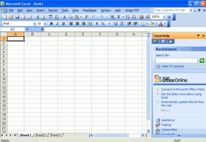
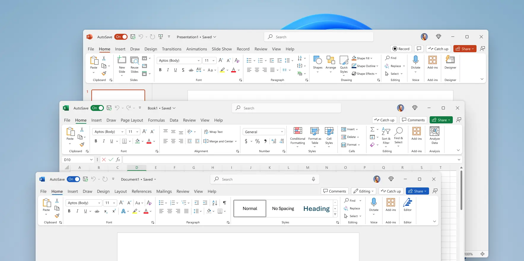
Why did UI’s turn from practical to form over function?
E.g. Office 2003 vs Microsoft 365

It’s easy to remember where everything is with a toolbar and menu bar, which allows access to any option in one click and hold move.

Seriously? Big ribbon and massive padding wasting space, as well as the ribbon being clunky to use.
Why did this happen?


Weirdly as someone who has used both styles heavily, I’d say the ribbon is more practical than the old toolbars. There’s more contextual grouping and more functional given the tabs and search, plus the modern flat design is less distracting, which is what I’d want from a productivity application. Also for me two rows of toolbars & a menu is about the same height as the ribbon anyway, and you can collapse the ribbon if you want to use the space
Yeah, does anyone else remember the menu bars that would show up and disappear depending on what you were doing? Those were awful–the ribbon method of context-specific tabs is better (IMO).
I remember people being upset by the ribbon back when office 2007 was released. Their complaints made sense until I sat down and used it. Found it to be a great improvement. I switched my libre office to the ribbon layout as soon as they added it. Because I don’t use it often, it’s great for finding stuff compared to looking through the menus.
The nice thing about the LO implementation is also that they added a couple of varieties of the design, like the compact one which pushes things closer together so it’s not distracting.
It’s like having a robot vacuum. You’ll catch yourself saying “Why is it ALWAYS getting in my way??!” It’s not, it’s just that you only think about where it is when it’s in your way. When it’s not around you, you are thinking about other things.
UI is the same. People complain about any UI they actually stop to notice. If you know the UI well you don’t even really think about it, you just use it. When a UI changes you have to relearn a little bit and this causes people to have to stop and think about the UI.
99.99% of the time people seem to interpret this as “This UI objectively sucks! Any UI I need to think about must be terrible!”
But it’s not that hard to understand that a little relearning will follow change, and that things will have to change over time unless they were perfect forever out of the box, which nothing is.
But no. “The new update is horrible!” Every. Time. It’s so routine to UI designers that they totally ignore this feedback. So people really shouldn’t even bother to post it.
Flat design may be less distracting to you but that also means it’s less clear, because there are fewer obvious demarcation.
I despise flat design, it’s downright awful design, and done for looks rather than functionality.
Even saying it’s “less distractive” supports this.
Microsoft also did this to obfuscate features, which is pretty apparent when you consider new users used to “discover” features via the menu system. I supported Office for MS in the early days, and this was a huge thing at the time. It was discussed heavily when training on new versions.
to you
Flat design dominates for a reason—the less visually busy something is, the easier it is for users to wrap their heads around it. This gets proven again and again in user studies, the more busy and dense you make things, the more users miss stuff and get lost.
People’s opinions on the ribbon specifically are obviously all subjective, but I would say the less distracting design would be the one done less for looks, rather it’s a pretty utilitarian design if you pick it apart. This is an interface for productivity tools, and as such the interface should get out of your way until you need it—the ribbon just does that better IMO.
Why on earth would Microsoft want to obfuscate features? There’s no way that motivation would ever make sense.
IIRC one of the main reasons Microsoft introduced the ribbon was that grouping functionality contextually helped users discover features, because people kept requesting features that already existed, but they just couldn’t find. I remember there being a blog on the Microsoft developer site about the making of it that went into this.
All that usability testing that Microsoft did is a big part of the problem. Instead of the functionality of functionality being organized under menus by function ….
They made “typical” functions more accessible to “typical” users, but I’m not typical; most people don’t match that average profile. Anyone who uses Office at all frequently are not average users. Anyone who frequently needs a particular functionality are not average users
Instead of being organized under menus by name, it’s now organized under ribbon tabs by icon, visual grouping, and sometimes also name. It’s no less organized lol
Granted the icons are getting better over time, but all too often I’m still looking for the name to figure out what that mysterious icon is. Now I need to adjust the screen size so more names appear so I can figure out what to click. Wouldn’t it be nice if the names were all visible at a click, organized hierarchically?
Why wait for a click? Each ribbon tab has submenus with their contents already visible (no necessary click --> hover/click --> hover in submenu without letting your mouse leave for even 1 pixel) and the state of each option represented in whatever way is most convenient (button, toggle, dropdown, etc.). A menu doesn’t show all options in one category at once, doesn’t fully show their state, and closes itself every time you mess up a mouse movement if it’s programmed badly. The lack of names can be bad, but the learning curve for identifying options (hovering and seeing the name) isn’t worse than it is for finding options in a menu (searching every menu until you find the right option).
How many UI/UX usability studies have you done yourself. Links to results.
Since when is it not okay to have an opinion on how you’d like your computer to work? You’re saying it as if usability was an objective truth, not a preference of majority of users. People are different, everyone is talking about neurodiversity, and you’re saying that loving lowest common denominator UIs are the only acceptable opinion in the light of objective facts.
lol